Charts & Infographics
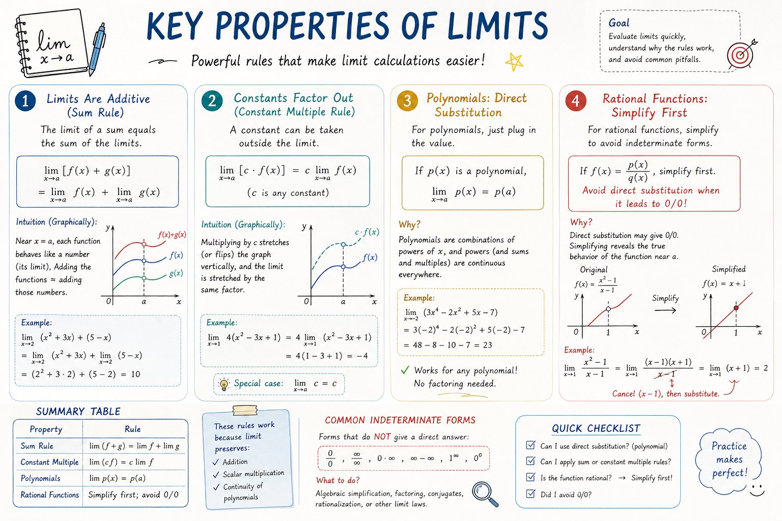
AP Calculus 学习表信息图
来源: @hqmank
分类与属性标签
PROMPT WORKSPACE
TXT
Please create a mathematical visualization infographic about "[math concept / topic]." The goal is to help the viewer intuitively understand what it is, why it works, its geometric or structural intuition, and how it behaves in different contexts. The visual should feel like a high-quality math lecture handout combined with a hand-drawn educational poster. It should be elegant, clear, and information-rich, but not cluttered. Visual style: either portrait or landscape is fine. Use a clean, light paper-like background, with a deep blue title and black or dark gray lines for the main content. Add a small number of refined accent colors such as blue, teal, gold, and red. Incorporate rounded-corner cards, thin borders, numbered labels, hand-drawn arrows, zoom-in callout boxes, and a summary section. The overall design should be aesthetically pleasing, balanced, and academic, allowing the viewer to grasp the structure of the concept and why it works at a glance.💡 技巧提示
此提示词已在 Midjourney/SD 实际生成中得到验证。您可以直接复制上面的代码并在绘图工具中运行,也可以替换其中如人物、色彩、构图等关键词来实现定制效果。